

Uplevel Your Website Design With Custom Fonts in Squarespace 7.1
I love that anyone can get a great-looking site up quickly without any custom code. There are tons of great fonts within the Squarespace platform that I have used on high-end designs. However, sometimes a custom font will really uplevel the entire site with just a new font.
Some of my favorite places to purchase unique fonts that will stand out on a website are CreativeMarket.com or Envato Elements
Here is my CSS code for adding custom fonts to Squarespace 7.1. You can also watch the video tutorial as well.
Custom Fonts in Squarespace 7.1:
Copy the following code into the custom CSS section of your website.
Make sure you have a licensed font, meaning you have purchased the license to use it.
Upload your font to the custom files folder
Delete text within the parenthesis that starts with “unique-url-for-your-file”
Insert cursor and your custom font should show up in drop down or click on the file to make it insert into the code
Replace ‘font-name’ with the name of your font (it does not need to be exact)
Replace the ‘font-name’ in your h1, h2 and h3 sections with your new font name
“//Custom Fonts Squarespace//
@font-face { font-family: ‘font-name’; src: url(unique-url-for-your-file: click the file in your custom file folder to get this url) }
//Heading One Font//
h1 { font-family: ‘font-name’, alternative-web-safe-font; }
//Heading Two Font//
h2 { font-family: ‘font-name’, alternative-web-safe-font; }
//Heading Three Font//
h3 { font-family: ‘font-name’, alternative-web-safe-font; }
//Normal Font//
p { font-family: ‘font-name’, alternative-web-safe-font; }
//Quote Font//
.sqs-block-quote blockquote { font-family: ‘font-name’, alternative-web-safe-font; }
//Quote Source Font*//
.sqs-block-quote .source { font-family: ‘font-name’, alternative-web-safe-font; }”
Watch the Video Tutorial on how to add custom fonts in Squarespace 7.1
You May Also Like:


Website Design for High-End Wedding Videographer Using Squarespace
The challenge was to create a high-end website design for a wedding videographer in the San Francisco and New England area using an easy-to-manage platform like Squarespace. This website has all the elements of a high-end creative website, setup with SEO so my client can get found locally and designed with a know-like-trust strategy that turns visitors into leads.

Website Design for Wedding Videographer


Want this design?
Want a website like this one? Fill out the inquiry form and let’s set up a time to chat about your goals.

Website Design for Health Coach


Want this design?
Want a website like this one? Fill out the inquiry form and let’s set up a time to chat about your goals.
Create A Beautiful Website In Minutes
I've seen so many business owners get bad advice on building a website who end up getting stuck and frustrated.
If you are brand new to business and brand new to web design, please use one of the simpler to use platforms such as Squarespace. I've worked with all different platforms, and if you're curious which platform is right for you, you can message me. But, for my start-ups and new business owners, I always recommend Squarespace.
Squarespace has improved tremendously over the last 2 years and it’s easier than ever to create a beautiful and functioning website in a very short amount of time.
Here is my quick tutorial of how to create a website from start to going live. You can build all the pages, colors, and fonts in literally less than five minutes. And you can finish your entire website in as little as an hour with Squarespace.
Setup Your Squarespace Pages
So we're going to go to Squarespace.com and we're going to hit the button that says get started. Now from here you are able to choose from their pre selected templates.
You can choose by industry or by type, but today we are going to build our own from scratch using the build your own template. From here, we're going to say, let's go.
What is your site called? You're going to put your business name here.
Hit next. From here, we're going to hit an intro section. We definitely want an intro section. You can choose from different layouts for your header.
You can choose whichever one you like. If you have products, you can add products. We're going to add services section. From here, you can choose different styles for your services.
Then we're going to choose the About section, you’ll see several different layout to choose from. Then we also have a social section. We're going to keep this one simple. And then we're definitely going to need a footer section. We can do a pretty standard one, two column, three column. Or we could add a large photo at the bottom, which I think looks pretty fancy. Then we're going to click “next.”
You’ll see next the other pages you want to add. Add other pages like the about page, the contact page, and services page.
Then we're going to click next.
Choose Your Colors and Fonts
Now we're going to choose a color palette. Squarespace has made it super simple by giving you color presets to choose from. You can always changes these later to more custom colors.
If you need help with choosing fonts and colors,
download my free High-converting Website planner.
Next you can choose your fonts. Squarespace has create pre-made font pairings for you to make things super easy. They are grouped by sans serif, serif, and then a mixture of both. Again, this is just based on what kind of feel or mood you want to portray with your brand. See my post here about how to choose fonts for your website.
We're going to choose Fino for this one just because it looks a little more high end for a wedding photography website. And then we're going to hit finish. And now our template is ready! Yay! Literally done in minutes!
Squarespace does have an AI section where if you would like to have it write text for you, you can hit continue and write a little paragraph about your business, and it will generate some text that's more custom to you.
We're going to skip that for now.
Editing Your Squarespace Website
You’ll notice a sidebar with menu items. This is like your table of contents. You're mostly going to be working in the website section because this is where your pages are. Click on “website.”
You'll see the main navigation has your main pages up in the top corner.
Your home page is under the not linked area because the logo is your link to home. So it doesn't need to be, it doesn't need to be added into the main navigation. If I move it up to the main navigation, it would show up as a menu item in the top navigation. But, we don’t want to do this, since this is redundant. Your logo is the home button. So we keep that in the not linked area.
So how you edit your website is pretty simple. You hit the edit button to edit directly on the page. Each section is highlighted by these blue lines that show different sections. You can add more sections in between and in between you have also pre designed areas. So if you wanted to add more about maybe your staff or your products.
or another services or maybe your portfolio, you definitely want to add a testimonials. Let's do that right now because I want to make sure we get some testimonials in here. Let's add some testimonials in here. Now, oops, I didn't want it right under the header. So what we're going to do is we're going to move it down.
So when you hover over a section, you'll see this navigation over on the right side, you'll see these arrows of moving up or moving down. And I can move this below our brand. I want it almost to the bottom. Yep, so our social media is at the bottom. I've got our testimonials on the second to the bottom.
You can also heart certain sections so that if you want to add this same section to another page, you can click heart so that when you add another section, go to your saved sections, and you can now add this section to any other part of your website on any page, which is super helpful and speeds up your process greatly.
You can also duplicate a section if you'd like to keep that layout. And maybe move it down.
Okay. So now is how do we change photos and how do we change text? So changing text is pretty simple. We just highlight the text. You can start typing just like any word editing software. You can highlight certain areas and change the color. You can make certain words italicized. You can even underline certain areas as well.
We can change the colors of these outlines. All of that, although I do not like any of that. So we're going to hit undo because I do not like any of that. Undo is command Z, um, at least on the Mac. So, how you want, if you want, We also have a button down here. If you click on the button. You can hit the edit button.
You can change the text of what you want it to say and the link. How you change the link is you're going to click on this little gear icon. You can make it point to a page. So if you hit, it'll show you your pages or if you don't see it, you can start typing which page you want to show up, your contact page.
And it will link to those pages. You can choose whether you want it to open in a new window or not. Or if it's going to an outside web address, you would paste the web address here. Or it can go to a file, an email, or even a phone number. Then just click off when you're done. And make sure and hit save so that it makes it live.
We're going to change the top header here so that you can see where your logo is. If you have a logo, you would upload it here. You can also change your site title there. If you have a mobile logo, you would add that here. Some of the elements to put up at the top is if you would like to add a button, which I do suggest because that is going to be on every page and allows an easy place for people to um, basically.
no, exactly what action to take? What we would say is get started, but we would link it maybe to your contact page. So that it goes to the correct page you can also add social links but I do not recommend adding social links to the top header because we really want them to hit that get started button and Not go away from your website to social media There's also some different styles if you'd like to play around with different types of headers There's gradients.
There's solid color There's a dynamic And if you'd like to add a border to, let's say, just the bottom of it, you can add a border to the bottom as well. And then just click off and click save when you're done. Now, how do we add or change photos to our website? So these are already placed, which is fantastic.
How to change these is you would click on it, click that pencil icon, and from here you can replace it, you can delete it. We're going to delete and we're going to say add image, you can either upload a new one, select from your library that's already been uploaded to Squarespace, or browse stock images, which is what we're going to do.
We're going to browse some stock images. So as you can see, you could alternate between your library, free images or premium images, which gives you some more options. Free images are pulling from Unsplash, so if you'd like to go to unsplash. com and kind of search for those ahead of time, you can, or you can search directly in here.
We're gonna use some search terms, and we're gonna say... We're going to look for a vertical image here just so it fits really nicely in that spot. We're going to hit add image.
Yep, it fits. And we want to make sure that it's set to fill so it fills that frame. And then if you wanted to link on image, you can add a URL here or use the, use the gear icon to link it to another page on your website. The image alt text is going to be for,
yeah. So same idea with all the other ones. We're going to delete and we're going to browse stock photos. And we're going to look for certain imagery. We're looking for vertical imagery. Let's try this one.
Click off of it. Then our third one, same idea. We're going to browse
and we're going to choose this one.
When choosing photos, keep in mind the color palette of the photos. The more cohesive they are together, the better. That's going to make your website look branded and also really easy on the eyes. You can change the focal point of your... You can change the focal point of your image by moving this circle over the area that you want to be in the center of the photo.
So we like that one. When we're done, we're going to hit save. Then how you edit is just start typing your service here and you can type in your pricing there. If you'd like to add buttons, you can also add buttons as well.
Let's say we want to add items to a certain section, this section doesn't have much on it, so we are going to add from this add block, we can add image, text, buttons, galleries, videos, forms, audios, newsletters, shapes, accordions, all kinds of things, um, there's quite a long list, the most popular ones are up at the top, so that would be text, And if you hit command G, you'll notice that there, well, you can't see it because there's a photo on here, but there is a grid on there.
If I delete this photo, you'll see the grid and you can move your items anywhere on that grid. Uh, I'm going to hit undo so that I can bring that back, which is command Z. From here, you can type whatever you want and you can change the size by hitting. Headings or paragraphs. Now, heading one is only reserved for your very top heading section.
That is an SEO thing and a Google thing. So you can use heading two, heading three, heading four, or the paragraphs for every other section, but only use the heading one once per page. So we're going to say we want to use maybe heading three. We want it a little bit larger here and we can add a paragraph underneath it.
That we can grab and pull and say, and we want that in this section. So you can adjust the boxes, you can make them longer, you can move them around, you can overlap things. Let's say if we want a block, a shape, we want a shape to go behind that text. We're going to move that and then we're going to say move backward two times and then we can move our type so that it fits into this nice shape box.
So there's a lot of fun things you can do with Squarespace. I really just want to do an overview so that you guys have an idea of how to edit this and really get this. Um, this is going to be your about section, so make sure and put your photo in your about section and then a little bit about you. This is going to be your testimonial section.
This is a little bit different from the other section in that it has predetermined content sections. So in addition to edit section, it adds edit your content. So this section you can't edit directly on it. You would hit. it, edit content, and then under the content bar, you'll see all of your testimonials here.
So the first one, you would add a photo. If you want to add a photo, you don't have to, the title, and then the description maybe would be their names as well. And you can move these around. And you can also choose if you would like to have a title, you can change that title, let's say testimonials,
you can also change if there's a button over here or not. And if you don't want to show an image, you can just have it be the testimonials. You can also change how they are displayed, and if you only want two per section, three per section, or more, you can show the adjacent slides, and then there's some more adjustments.
But we really like this, um, with the image, so we're going to keep it that. If you'd like to change the color, How to change the color is under the edit section, and you'll see colors. So we can change the colors here. Let's choose that green color. The final section, well not final section, the next section is follow on social media.
There are two ways you can do this. You can connect your Instagram to Squarespace if you'd like it to automatically pull your photos, but I like to curate this section so I know exactly what photos are showing up on this section. And so these are all just individual photos that link to Instagram.
So again, this one has a edit content section. Where if you go to the content, all the photos are added individually. So same idea of changing, you can replace, upload, or select from library, and then you can move them around. And then the button, you would choose which Instagram you want it to link to, so that link will be there.
And then your last section is the footer, and also make sure to add your name, add your information. We're going to repeat the navigation down here as well. This is just helpful for people so they don't have to scroll all the way back up to the top.
So we're going to type about services, contact. We're going to make these the paragraph one, and then we're going to, how we add links is highlight the word. Just as in a word editor program, we're going to hit this link button and then we're going to link it to a page. So we're going to hit the backslash and we're going to say about, and then hit apply.
And then you'll see that line show up, then we'll hit services. We're going to type in services. Hit apply, and then the contact, we're going to hit that backslash, contact, and then hit apply. So now you have links to all of your navigation, add your information down here. If you'd like to add your privacy policy and your copyright as well, you can add that at the bottom and then make sure and hit save.
When you're done editing, hit the exit button. And when you're ready to go to your other pages, just click on the left side to the other pages. Here's where you can edit those. Remember to hit the edit button.
Your contact page, the thing you're going to want to change here is make sure to add your email address to the form. So this right now will go to a, um, this This form defaults to the email address that you sign up with. If you'd like to go to a different email address, you're going to click that pencil icon and then hit storage and you can change the email address that you want it to go to.
Okay, the very last thing we need to do before we go live is get our domain name and go live and hit publish. So we're going to go back to the main navigation and we're going to scroll all the way until we see settings. The very first section is domain, so we're going to say either get a domain through Squarespace or transfer or connect a domain through an outside or third party company, you can do either one, you can choose get a domain through Squarespace and it will walk you through it, it's about 20 per year to buy through Squarespace, but you can always transfer it no matter what.
So once you get your domain name, your next way is to go live. So we're going to hit this site availability, which shows that it's private right now. So nobody can see your website except for you. When you're ready to go public, you're going to have to upgrade to a hosting plan. So see right now it is grayed out.
So we're going to hit upgrade to publish. And you're going to choose the best hosting plan for you. I definitely recommend the business plan if you are a business because it offers some things like your Google Analytics connection, it allows e commerce if you're going to sell some products, um, customer accounts, gift cards, those kinds of things.
Obviously there's more the higher you go, but if you don't plan on doing any of that just yet, the personal is totally fine. Um, obviously you're going to save more money by paying annually. But if you pay monthly, it is a little bit more. So choose which option is best for you. Once you have chosen your plan and made your payment, you can now, you can now go live.
So you would either hit publish, this would turn into a publish button at the bottom, or you could go back to settings, go back to site availability, and that public button should be black so that you can hit public and your website will be live and you will be ready to go. So that was a very quick overview of how to create a website in less than an hour.
We did this in just about 20 minutes. So let me know if you have any questions. Um, I know there's lots of tutorials on Squarespace. Squarespace has lots of tutorials, but this is just a real quick way to get you started so you can get live fast without the overwhelm. Enjoy.

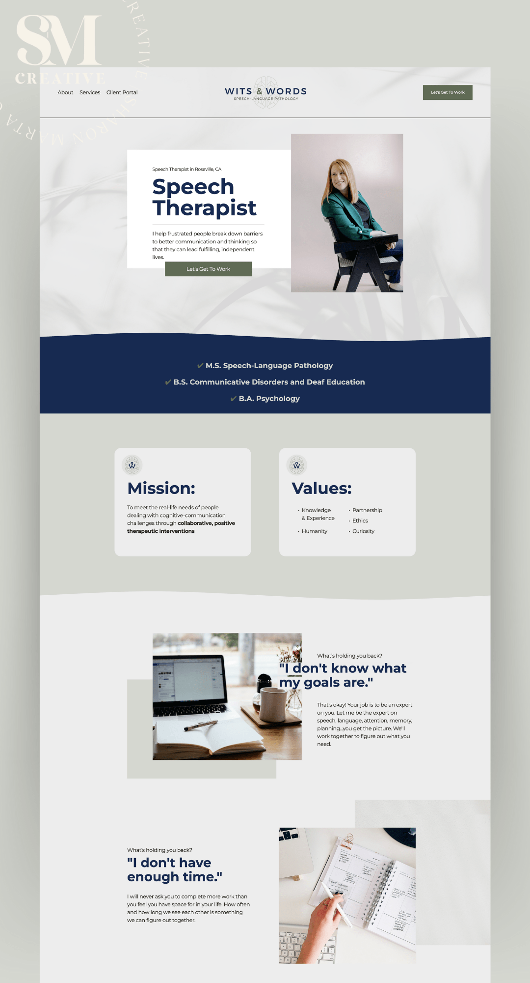
Website Design for Speech Therapist
Starting a brand new business can be tough. Sarah did all the right things to get her started on the right foot. She invested in professional photography, professional branding and professional web design. She will be standing 10x higher than her competition.
BRANDING + WEBSITE DESIGN in Squarespace for Speech Therapist


Want this design?
Want a website like this one? Fill out the inquiry form and let’s set up a time to chat about your goals.

Website Design for Church Ministry using Squarespace
This church ministry has had an entire branding makeover, from their logo, sub logos, invite cards, booklet and now website. This has been such a fun project to really dive into a more modern take on church and ministry design. Attracting a younger and more modern audience.
BRANDING & WEBSITE DESIGN for Church Ministry


Want this design?
Want a website like this one? Fill out the inquiry form and let’s set up a time to chat about your goals.
How to Choose Fonts for Your Designs?
Do you ever feel overwhelmed when you open up the font menu and see a seemingly endless list of available options? With so many font choices, it can be difficult to decide which is the right fit for your website. Choosing fonts for your website requires more than just aesthetics: you need to consider readability, message, tone, and more. In this article, we'll take a look at all the factors that go into selecting the perfect font for your website, and share actionable tips on how to choose the best font every time. By the end, you'll have the knowledge needed to make the best font decisions for your website and give your visitors an unforgettable reading experience.
So today we are going to talk about how to choose fonts. So I need to , go over some basics so you understand what the purpose of certain fonts. are, and then it makes it so much easier to choose which font you want to go with. So when you're deciding which fonts to use for your website, we want to keep a few things in mind.
1. An Overview of Font Types
Statistics show that people are 83% more likely to enjoy reading a piece of content when it has an aesthetically-pleasing font.
There are three main categories. There's a lot of smaller categories, but we're just going to talk about the three main categories. Keep this super simple. So we're going to talk about serif fonts, sans serif fonts, and handwritten or script fonts. So, serif font means that they have the lines at the end, they're like feet on the end of the font.
SERIF FONTS:
A serif font is a typeface that includes small lines called "serifs" at the ends of characters. It's considered an old-style font and has been used for centuries to read traditional print media like books and newspapers. Serif fonts are thought to be easier to read than sans-serif fonts, or those without any flourishes, and are often used in print media. For example, according to a recent study, nearly 65% of magazines and books still use serif fonts instead of sans-serif fonts for their main body of text.
Times New Roman, Baskerville, they have these lines at the ends of each font. Bar. So, they're like feet. Sans serif, if you know French, sans means without. So, sans serif means without those feet on the ends of the letters. Handwritten or script is pretty obvious. It's handwritten looking or script looking.
So, when we are choosing. fonts. We need to keep in mind what is the message that we want to send with our business or with our website. So there are a few things to think about.
So serif fonts are usually reserved for a more traditional or professional look. It's a very common font and used quite often in headings and body copy. So it's very easy to read and it's usually in books, um, newspapers. Things like that has a little more traditional feel to it, they can also be modern.
There's a lot of modern serif fonts right now, but usually it is a feel of traditional or classic looking fonts.
SANS SERIF:
Sans serif fonts is a little bit more casual feel to it. It can also be modern feeling to it. These are also very popular for headings and body copy. They can be in small type as in like for books they can also be very modern and kind of high end as well. So keep in mind what kind of feel you want if you want to choose sand serif.
HANDWRITTEN/SCRIPT:
Handwritten or script fonts, these are definitely a little more relaxed. They are a little more personal, but they can also be a romantic feel or a more feminine feel to them. You'll see these on Just sporadically here and there because they are very hard to read. So I would say only use these for headings or just single words here and there.
Because when they're small and a lot of words next to each other, as in body copy, like a big paragraph, they are very hard to read together. So usually used as more embellishments or as a texture. not as far as needing to read it necessarily because it is more a little more artistic looking definitely can be hard to read So just keep that in mind with handwritten scripts if you are going to choose a handwritten script and you need it to be Read as in on your website, make sure it's a script that is easily read.
There's a lot of script fonts that are kind of hard to read, so I just wanna make sure you keep that in mind.
2. How to Combine Fonts Together
So now you know, kind of the feel of each category of font. How do we combine them together?
So a good rule of thumb is to usually only use two different fonts that are in different categories. So if you're going to use two different fonts, we're going to say, we're going to pull a font from serif and sans serif. We're going to say, we're going to use these two fonts. Maybe my serif font is going to be My body copy and my serif font is going to be my heading.
They want to be really different from each other.
Or we could say we're going to use the hand script, handwritten script for the heading. and maybe sans serif for the body copy. So we're going to choose one font from each category. The problem comes when you choose two different fonts from the same category.
We're going to change it to Baskerville and this one is Agatho. So as you can tell, these two fonts are really close together in looks. It's really hard if you don't look super, super close to tell the difference between them. The problem when you use two different in the same category, because they're so close, it's really going to irritate the eyes because people are going to know something is off about these two fonts and I can't quite.
Figure out what's wrong with it. And it's because there are two different serif fonts. You really want to keep consistency within the same category. So if you're using a serif font, make sure all of the serif fonts you're using are the same, unless they're dramatically different from each other. And it's very obvious that they're different from each other.
Otherwise, it's just too hard on the eyes to see just while you're scanning things and it's going to look off. And we really want to make sure that our website looks clean and easy to read. That is very important for website design and website conversion.
3. Where to Find Done-For-You Font Pairings
Now if you'd like the work done for you, there are a lot of places that you can go where font pairings are already pre chosen for you and it really helps with choosing font pairings. If you go to Pinterest And just type in font pairings. You can be specific if you want to do feminine font pairings. If you just type in font pairings, you'll start to see some fonts.
There's some free serif font pairings right at the top. Canva font pairings, which means they're free or. part of the paid program, but that is also helpful if you're using Canva. If you scroll down, feminine font pairings, which are helpful or timeless, font pairings. These are really great. So start saving these to a Pinterest board.
4. Squarespace Font Pairings
Now, for my Squarespace users, Squarespace makes it really simple if you want some font pairings pre done for you because they have them all ready. So, when you log into Squarespace, you're going to see this as your back end.
You should see your left navigation and then your top bar navigation. We're going to click this little paintbrush.
And that's going to open up the site styles. Now under the site styles you'll see fonts. Click on fonts. And then you're going to see these font packs. And this is where you can choose different font packs. So we're going to say switch. And then you can click on each font pack. to see what it looks like in real time.
And it'll show you different versions, a little bit more modern, Baskerville. Yeah, so a lot of fun options
up at the top you'll notice that they've grouped the packs by serif or if you'd rather have sans serif. These, you'll have to adjust the sizes on these because the sizing changes with each one. But at least get a good idea for the font. So you have sans serif, serifed, If you click on serif, and then a mixed version, which is the serif and the sans serif,
and then you can go back and adjust the sizing of each one of those, either with the headings or the paragraph or the base size overall. And yeah, that's super easy.
If you are also using Canva, I highly recommend Canva, create a design. If you go to the text section right here. You'll notice that they have font combinations already chosen for you. Now, try not to look too much at the effects because you can take those effects off.
So, see these like, glow effect, if you don't like that glow effect, you can go to the effects and you can, say, none, and it will take the effect off. So, don't worry too much about the effects because that can be removed. So say happy birthday is a font pairing here. Let's look for another one. The hello darling.
Again, we can take off the effect and say none. And there you have two fonts that go together. Another one of my favorite places to get fonts is creativemarket. com. They also have font pairings.
If you go to the search bar and go font pairing. You'll see a lot of options where they've already pre chosen font pairings for you, a large header with a subheader.
Some of these are just one singular font, but you can see some of them are like font, this one says modern font duo. So you can also type in like modern fonts, and you'll see that this one comes with a script font and a serif font that come together and they kind of show you what they look like in different formats.
If you have words that you'd like, say it's your logo and you want to see what it would look like in that font, there is a preview section, which is really nice. And then you can see what your business name would look like in that font, which is really nice.
Now, once you purchase this font, you are going to need to know how to upload it to your computer. Apple makes this really easy, is when you download it, you can add it into the fonts program, and it'll pull into all of your Adobe programs that you use. I am not familiar with the Windows, so if you have a Windows, PC, make sure you know how to install fonts on your PC.
Choosing the right font for your website can be a difficult task, but with a bit of creativity and attention to detail you can create a website with a unique and appealing font. Research different font types, explore how font affects design, and find what works for you. With the right font selection, you can make your website stand out from the crowd.

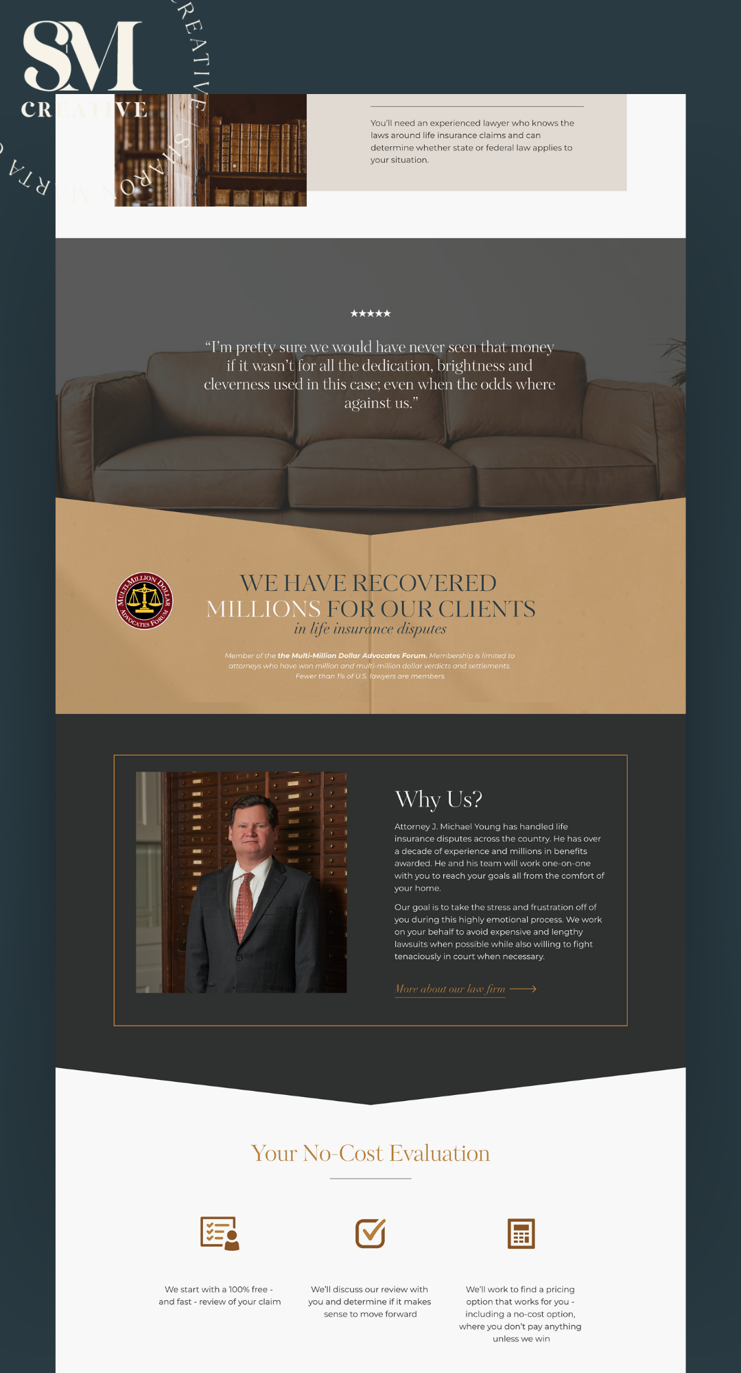
Website Design for Lawyer using Squarespace
Website Design for Lawyer


Want this design?
Want a website like this one? Fill out the inquiry form and let’s set up a time to chat about your goals.
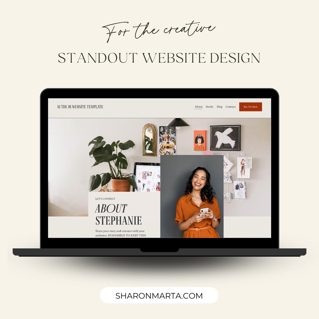
Website Design for Author/Influencer

Website Design for Author or Influencer

Want this design?
Get a much discounted rate on your custom website when you use this pre-designed template. Send me your colors and your logo and I’ll customize it to your business.